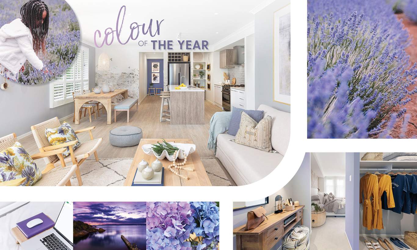
The Pantone Colour of the Year!
We were looking at the trends across the design and fashion worlds and we were excited to see the explosion of colour and creativity, which is no surprise after two years of lockdowns and lockouts!
A colour of Tassie
Colour is recognised as an expressive form of communication and a way to convey and affect ideas and emotions and engage and connect.
The explosion of colour has taken a truly Tassie theme with Pantone, the universal colour language, naming one of our favourite colours as 2022 colour of the year!
2022 Pantone Colour of the Year
'Very Peri' is officially Pantone’s colour of 2022, transporting us to the incredible fields of lavender in the north of Tassie.
We know our friends up at Bridestowe Lavender Estate will be thrilled with the choice and according to Pantone’s official release, the striking hue blends "the faithfulness and constancy of blue with the energy and excitement of red," creating a warm, positive and empowering shade”
“Displaying a carefree confidence and a daring curiosity that animates our creative spirit, Very Peri helps us to embrace this altered landscape of possibilities, opening us up to a new vision as we rewrite our lives,” says Pantone of the announcement.
We have been using this (or a shade almost identical) for a couple of years now as we love the connection it creates to our beautiful landscape; from the lavender fields to our incredible sunsets and we love how it complements our Wilson orange.
‘Very Peri is suited to an array of different materials, textures, and finishes,’ Patone explains. They add that the shade will provide a ‘pop of colour’ when incorporated through a painted wall, accent furniture, or piece of decor.
Very Peri Embraces The Possibilities
This year’s colour inspires us with creativity as well as old worldly belief in trustworthiness and gratitude.
This colour encourages us to embrace nature and all the possibilities and to add some playfulness and expression of colour into our lives, perfect after two years of lockdowns.
As Leatrice Eiseman, Executive Director, Pantone Color Institute, comments:
“As we move into a world of unprecedented change, the selection of PANTONE 17-3938 Very Peri brings a novel perspective and vision of the trusted and beloved blue colour family.
“Encompassing the qualities of the blues, yet at the same time possessing a violet-red undertone, PANTONE 17-3938 Very Peri displays a spritely, joyous attitude and dynamic presence that encourages courageous creativity and imaginative expression.”
Pantone themselves embraced the possibilities by selecting Very Peri, as this is a brand new colour created by Pantone for the first time ever in the history of its Colour of the Year forecasts.
The institute’s vice president Laurie Pressman says this is a sign of the global innovation and transformation taking place.
We love this colour and how it evokes a spritely, joyous attitude and dynamic presence that encourages courageous creativity and imaginative expression.
What do you think… will you be adding a pop of Very Peri into your home? We would love to know your thoughts – head over to our FACEBOOK PAGE and tell us!

